Virtual reality Infographic -
my bachelor thesis
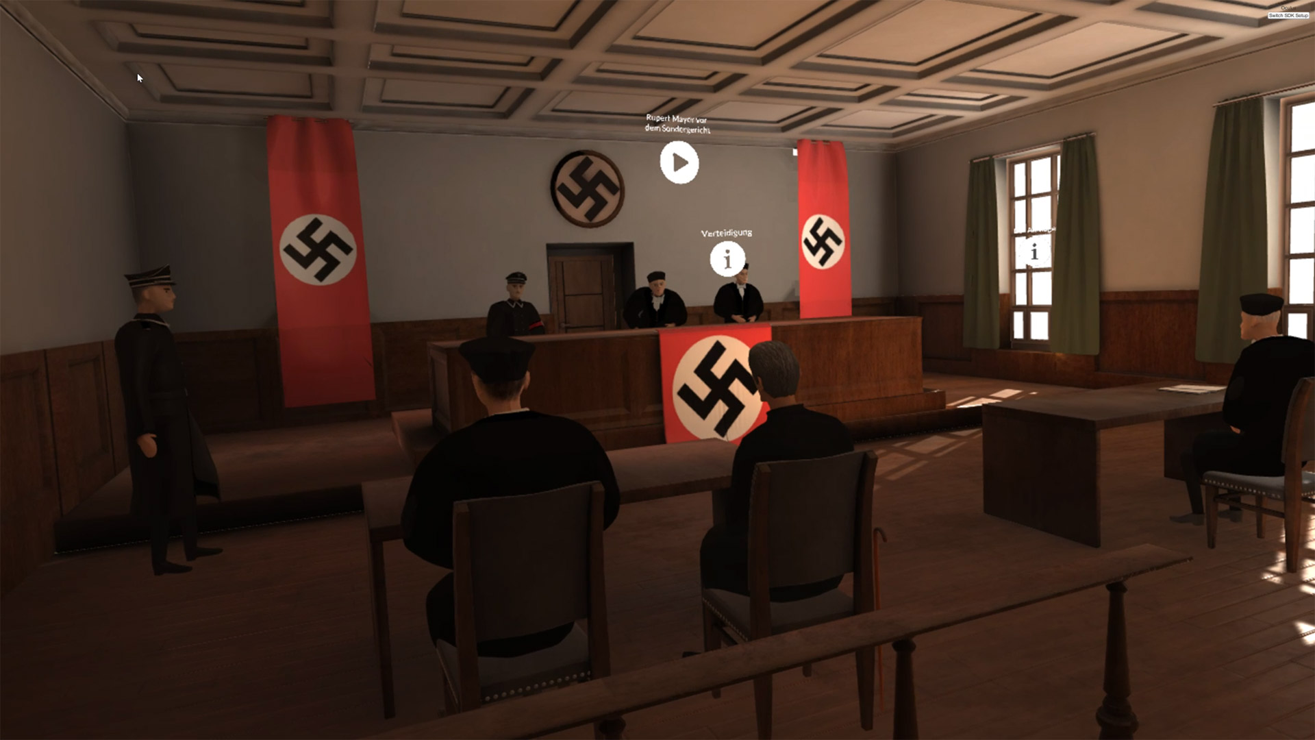
When it comes to virtual reality most people probably think of immersive games, in which a player can really feel and act as if he was on a different place. But there are more possibilities virtual reality can provide. For my bachelor thesis I tested two different concepts for virtual reality infographics. My idea was to let users dive into past times and experience a historic person in a new immersive way. I made two experienceable prototypes. Both of those had the same topic contentwise. They showed the life of the historical person father Rupert Mayer. He was a member of resistance in the time of the Nazi dictatorship in Germany.
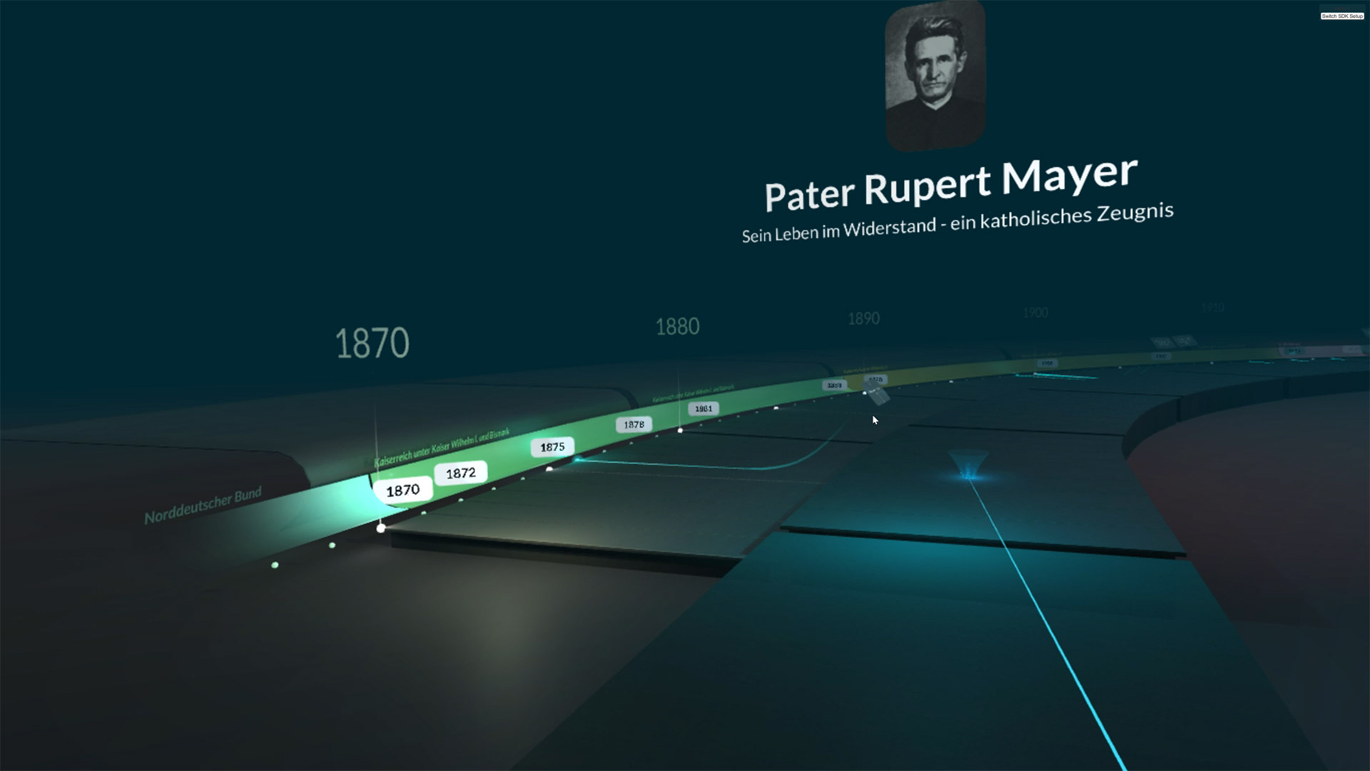
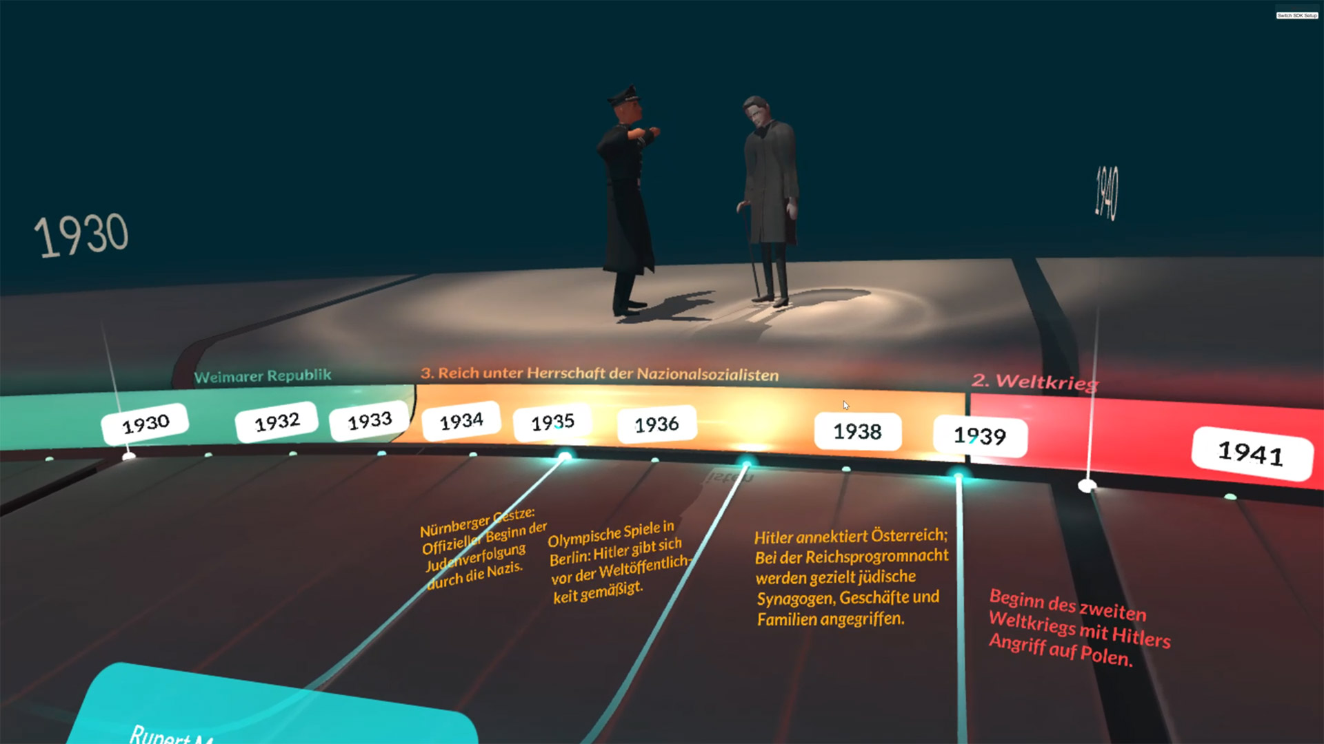
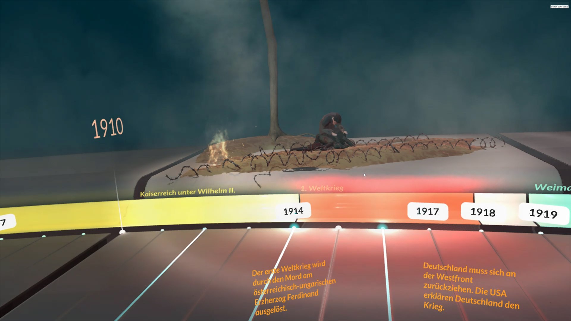
Concept 1 – an immersive timeline
The first concept covered the topic in a more abstract way. The overall look of this infographic remembers of a modern museum. A room-filling timeline, in which the user can walk around, was the main design feature. The infographic is arranged in a way, that should give the user a good overview on both the Life of father Mayer and the historical background.
Concept 2 – history experience
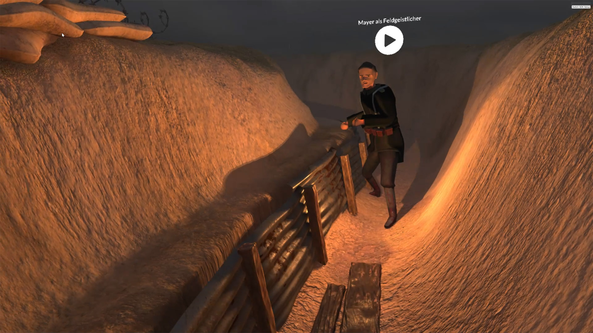
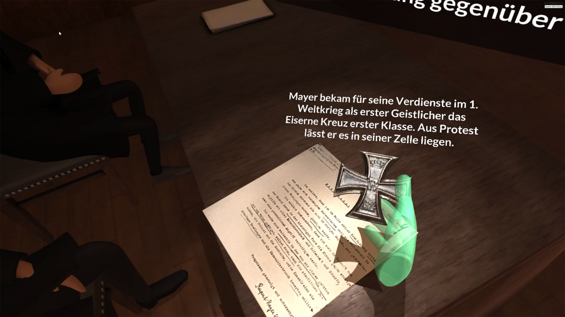
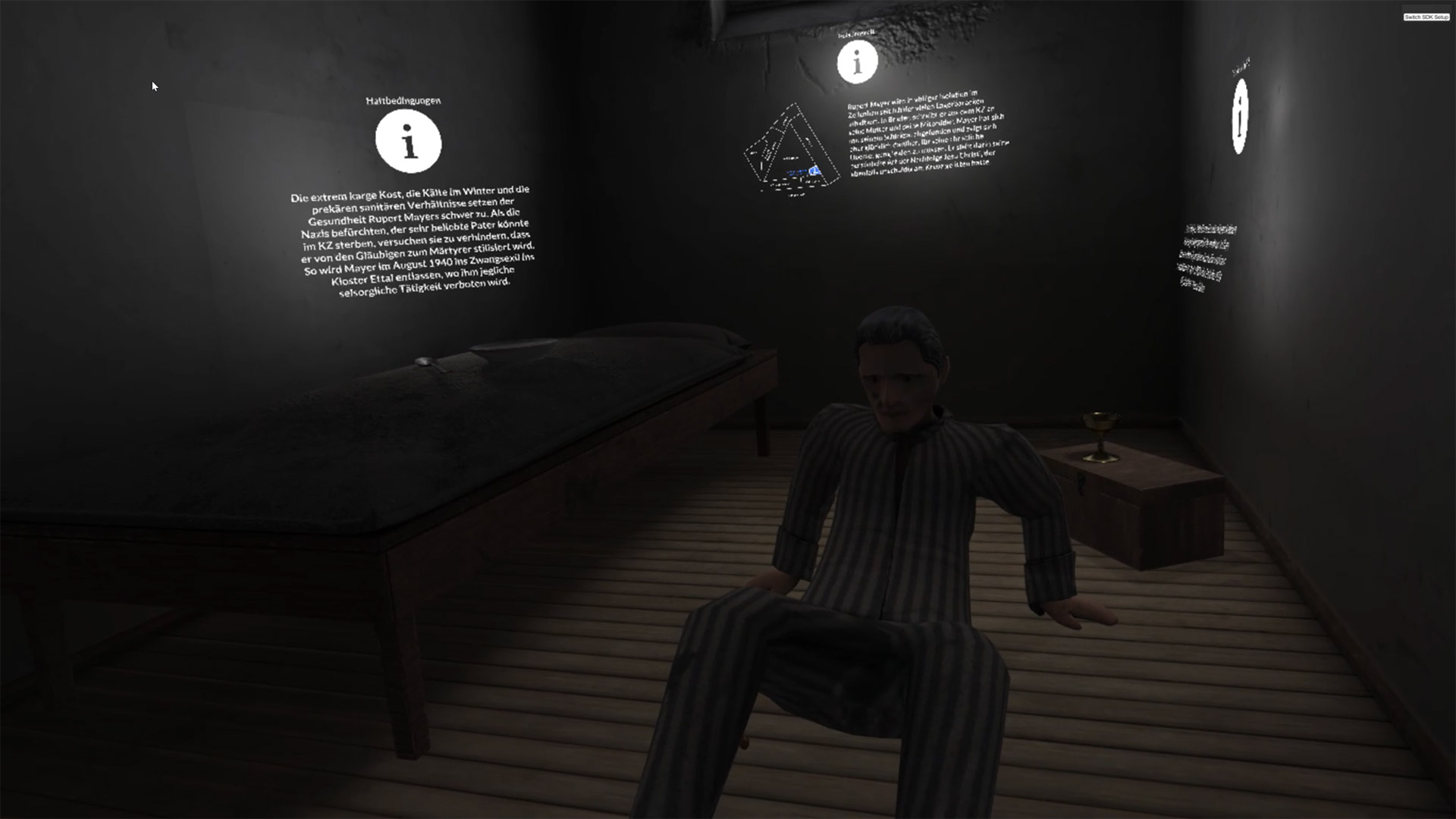
The second concept was more concrete and vivid. The users could walk through a virtual world with different stations. Each of them contains original sized objects and surroundings, that represent the different stations in father Mayers life. The world itself transports information for example through the purposely used light. With a klick on a button the user can completely dive into those historical scenes and get more detailed information about what happened there. Animtions of life-sized characters in a realistically designed world in combination with an informing voice over should make the information very vivid.
A qualitative study should find out how the users experienced the different ways of presenting the information. To achieve this I used the valence method. Users could press a button for each positive or negative emotion they felt, while they were in the virtual world. The method showed that the users in the first, more abstract concept felt like spectators while they really felt like being in the historical scene in the second concept. In those scenes, many had a strong feeling of being related to the shown characters. Especially the feeling of really being there was very stimulating for the users and they felt like they can act very autono- mous and having many possibilities. On the other hand, the visually more dominant surroundings of the second concept lead to the problem that users felt distracted and weren’t able to focus on the informational texts.
Almost all users said they felt like they have been better informed by the first, abstract concept. In total, the emotional reactions in the first concept seemed to be weaker than in the second one. In the second one positive emotions came up more often, when a user had the feeling that he really understood something or was able to combine different information. But many users said, that they were not able to process the information on an emotional level like they did in the second concept. Some of the more static visualisations caused a bored feeling quickly. It seems that more abstract surroundings require visualizations, that provide a higher level of stimulation to keep users interested.
